Unlock Responsive Design Your Ultimate Guide To WordPress, Astra & Elementor
Unlock Responsive Design
Your Ultimate Guide To WordPress, Astra & Elementor
The Indispensable Role Of Responsive Design In 2026
In today’s interconnected world, your website is the digital storefront, the primary communication channel, and often the first impression your brand makes. But what if that impression changes drastically depending on the device? With a staggering 60% of global web traffic originating from mobile devices and Google’s unwavering commitment to “Mobile-First Indexing,” a responsive website is no longer a competitive advantage – it’s a fundamental requirement for survival and success.
A truly responsive design isn’t just about shrinking elements; it’s about intelligent adaptation. It ensures that every button is easily tappable on a touchscreen, every headline remains impactful on a large desktop monitor, and every image loads swiftly, regardless of network speed. Failing to deliver this seamless experience leads to high bounce rates, frustrated users, and a significant hit to your search engine rankings.
At AnyaBlinC, we empower businesses and creators with the knowledge and tools to thrive online. This comprehensive guide will equip you with the “Power Trio”—WordPress, Astra, and Elementor—to build a website that not only looks stunning but performs flawlessly across laptops, tablets, and mobile phones
The Power Trio Explained
Why This Combination Excels
Understanding why this specific combination works so well is key to maximizing its potential. Each component plays a crucial, synergistic role in delivering responsive excellence:
- WordPress: The Foundation of Digital Presence
- The Global Standard: Powering over 40% of all websites, WordPress offers an incredibly flexible, open-source content management system (CMS). It separates content from presentation, making it ideal for responsive design.
- Vast Ecosystem: Its rich ecosystem of plugins and themes provides limitless possibilities, ensuring that your core website is robust and scalable.
- Astra Theme: The Performance Champion
- Featherlight & Fast: Astra is renowned for its minimalist codebase, clocking in at less than 50KB. This lightweight nature is critical for mobile performance, where every millisecond counts for user retention and SEO.
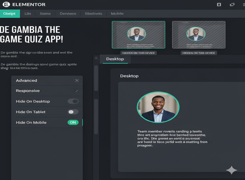
- Built for Customization: It offers unparalleled customization options through the WordPress Customizer and integrates seamlessly with page builders. Astra provides granular control over header layouts, footer layouts, and general site structure, which are all vital for responsive adjustments.
- Responsive Header Options: Astra includes dedicated features for responsive headers, allowing you to create different logos or menu styles specifically for mobile devices.
- Elementor Page Builder: The Visual Designer’s Dream
- Drag-and-Drop Power: Elementor revolutionized web design by offering a true front-end, drag-and-drop interface. What you see is exactly what your users get.
- Pixel-Perfect Control: It gives you granular control over every element – sections, columns, and widgets – allowing for precise styling and positioning.
- Dedicated Responsive Tools: This is where Elementor truly shines for our purpose, offering specific controls for different device types, which we’ll explore in detail.
Your Masterclass: Step-by-Step Responsive Design With Elementor
Let’s dive into the actionable steps to ensure your “WebSite” or any other website/Project delivers an optimal experience on every screen.
Step 1: Setting Up Your Workspace
- WordPress Installation: Ensure you have a fresh or existing WordPress installation.
- Install & Activate Astra Theme:
- Navigate to Appearance > Themes > Add New in your WordPress dashboard.
- Search for “Astra,” click “Install,” then “Activate.”
- Recommendation: Explore Astra’s “Starter Templates” (requires the Starter Templates plugin). These pre-built designs are inherently responsive and provide an excellent starting point, saving you hours.
- Install & Activate Elementor Plugin:
- Go to Plugins > Add New.
- Search for “Elementor,” click “Install Now,” then “Activate.” Both the free and Pro versions offer powerful responsive features.
Step 2: Mastering Elementor’s Responsive Mode
This is where the magic happens. Open any page or post you want to edit with Elementor (click “Edit with Elementor” from the WordPress editor or the front-end).
- Access Responsive Mode:
- At the Top of the Elementor editor panel, locate and click the “Responsive Mode” icon (it visually represents a desktop, tablet, and mobile device).
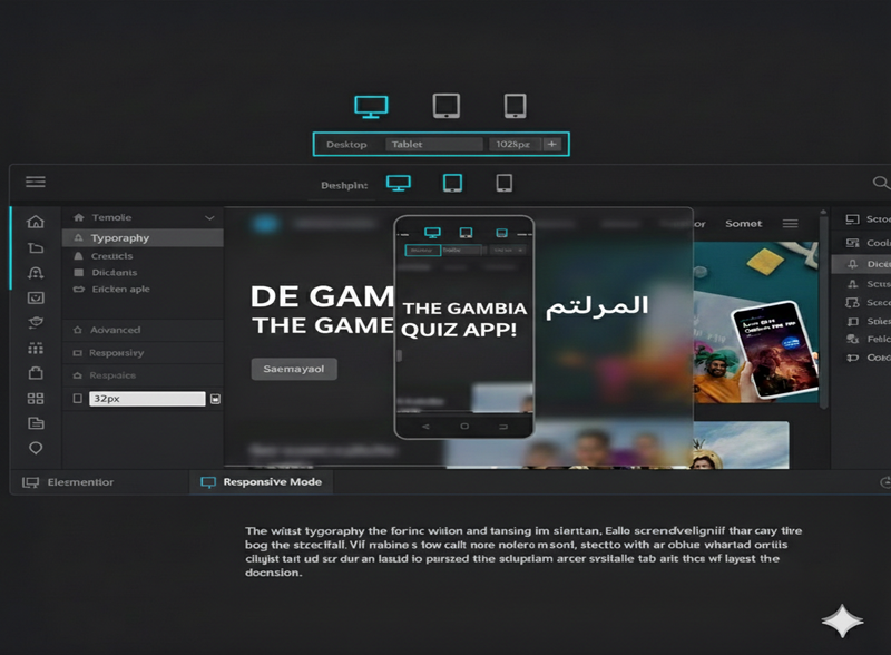
Switch Device Previews
- Once Responsive Mode is active, you’ll see three distinct icons at the top of your editor: Desktop, Tablet, and Mobile. Click these to instantly preview your design across different screen sizes. Elementor uses predefined breakpoints (which you can also customize in Elementor Settings).
Conclusion
Beyond Design—Building for the Future
Mastering responsive design with Astra and Elementor is more than just a technical checkbox; it is about respecting your user’s time and attention. Whether someone is browsing your Website on a smartphone while commuting through Serekunda or researching your services on a high-end desktop in a corporate office or home, their experience should be consistent, fast, and frictionless.
In 2026, the digital divide is closed by those who prioritize accessibility. By implementing the stacking strategies, typography scaling, and device-specific visibility we’ve discussed today, you aren’t just building a website—you are building an inclusive digital environment that thrives on any hardware.
The “Power Trio” of WordPress, Astra, and Elementor gives you the tools, but your vision provides the soul. Don’t be afraid to experiment, test on real devices, and continuously refine your mobile UX.
Let’s Build Something Remarkable Together
At Anyablinc, we know that the technical side of web development can feel overwhelming. You don’t have to do it alone. Whether you’re looking for a performance audit of your current site or a ground-up build of a new, fully responsive masterpiece, our team is here to turn your ideas into a high-converting reality.
Ready to elevate your digital presence? Explore our Services | Contact the Anyablinc Team or Subscribe for more Tech Insights